Project Overview
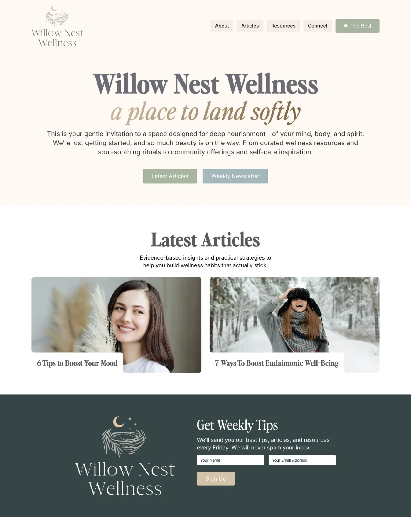
Willow Nest Wellness is a mother-daughter wellness partnership founded by Sarah and Hayley, offering coaching, educational resources, and evidence-based wellness guidance. With plans to expand into therapy services and launch a podcast, they needed a distinctive brand identity and digital presence that could cut through the noise of an oversaturated wellness market.
The challenge: finding an available .com domain and brand name that felt authentic, memorable, and differentiated in a niche flooded with generic wellness messaging. Through collaborative vision strategy sessions, we landed on “Willow Nest Wellness” – a name that conveys both nurturing support and natural growth while remaining distinct in the marketplace.
The brand needed to communicate authority and evidence-based credibility while maintaining warmth and approachability. The visual identity features a custom willow tree illustration with celestial elements, a sophisticated color palette of soft greens, muted purples, and warm neutrals, and elegant serif and sans-serif typography.
The website design balances poetic, inviting language (“a place to land softly”) with clear, conversion-focused messaging and generous white space. The result is a digital presence that feels both nurturing and professional, perfectly positioned for their target audience seeking wellness guidance that fits real life.
This initial launch establishes a strong foundation designed to grow and evolve as Sarah and Hayley expand their offerings and refine their practice over time.